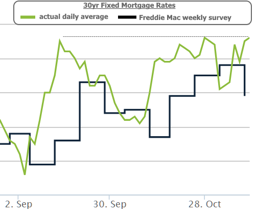
Last week, we discussed a fairly quick move toward LOWER rates. One short week later and we’re forced to discuss an even more abrupt move back toward HIGHER rates. By Friday, the average mortgage lender was quoting the highest rates in more than 3 months, and things could get worse before they get better.
In both cases, breaking news about the US/China trade deal was at the scene of several of the biggest swings. That was especially apparent in wee hours of Thursday morning when China’s Commerce Ministry claimed both sides had agreed to cancel a certain amount of existing tariffs as a part of the deal and that both sides had been in close communication.
The reaction in stocks and bonds was obvious. As we should expect, news that improves the outlook for US/China trade relations (or that simply speaks to tariffs going away) pushes stock prices and bond yields (aka “rates”) higher. Notably though, rates continued drifting higher even as stocks flattened out.
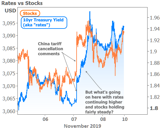
The divergence between stocks and bonds in the chart above can be hard to see. The following two charts examine specific pockets of time on November 7th where it was most obvious.
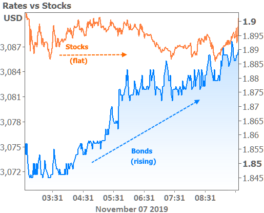
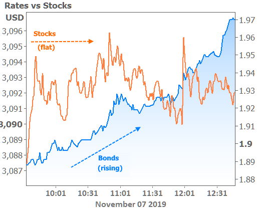
If we know the trade news was the motivation for the initial volatility and we know stocks and bonds are equally likely to react to it, we’re forced to conclude that the additional movement in bonds is due to something else.
While the trade deal is definitely the spark behind Thursday’s drama, other considerations have acted as dry powder for interest rates. By far the biggest of those considerations is the bigger-picture trend in the bond market. The way it works is surprisingly basic.
In general, bonds/rates have been doing so well for so long that they risk bouncing simply because we’re running out of past precedent that suggests the good times can continue to roll. If that doesn’t sound like an actual justification for trading momentum, it absolutely is! I you’ve ever heard the terms ‘overbought’ or ‘oversold,’ those are fancy ways to refer to the same phenomenon. Traders refer to such motivations as “technical.”
Technical motivation can play out differently depending on the market in question. Unlike the stock market, which has proven itself capable of rallying for more than 2 years without major incident (most recently from April 2016 until the end of 2018), the bond market rarely strings together more than a year of strong momentum without some sort of reset–especially when the year in question has covered as much ground as this one.
The chart below shows these ebbs and flows. The green numbers list the length of time (in months) that a rally trend has lasted and the amount of ground it has covered in terms of 10yr Treasury yields. Vice versa for the red numbers. Mortgage rate movement has been a bit different than Treasury yields, but the latter is what sets the tone for these bigger picture shifts.
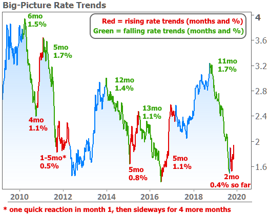
If you were hoping to see rates continue lower in 2019, this chart should scare you. The peak to trough improvement already matches the best example from the past decade (2011) and the length of time is certainly on the higher end of the spectrum. Granted, we can count the bounce in rates that’s already taken place over the past 2 months, but even then, we’d still have another 0.1% to go before matching even the gentlest example from the past.
Does this mean rising rates are a sure thing and a done deal? No one will ever be able to tell you such things with certainty. Past precedent is great until it’s not anymore. The best bet is to prepare for the worst and hope you don’t see it. At the very least, people with loans in progress, or those who are on the verge of buying or refinancing, should probably try to get that done sooner than later.
On a final note, if you read other news this week that suggested mortgage rates were LOWER and are wondering why I’m telling you they’re higher, that’s because they’re wrong and I’m right. And it’s all just a big misunderstanding.
Look closely at those articles claiming lower rates and you’ll see they are citing Freddie Mac’s weekly rate survey. There’s nothing wrong with Freddie’s data if you’re only looking for a rough overview of rate trends over super long-term time horizons. For day to day moves, however, their methodology can create a lot of confusion.
Freddie’s survey only accepts responses through Wednesday morning, but our vast experience comparing Freddie’s numbers to actual rate sheets suggest the survey is mostly measuring rates that were available from Friday afternoon through Monday afternoon. As such, the more things move on Tuesday through Friday morning, the farther from reality the survey can be by the time it’s released on Thursday morning. Simply put, rates moved up to 3-month highs this week, NOT back down to 3-week lows.
