Coronavirus made for record-shattering movement in financial markets and economic data. With lockdowns ending, investors are eager to see improvements. Instead, they’re finding plenty of mixed signals.
One of the most basic examples would be the relationship between stocks and bonds. Investors tend to buy stocks when the outlook is positive and buy bonds when the outlook is negative.
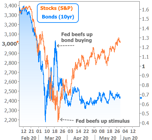
It was no surprise to see stocks fall abruptly as the pandemic’s impact became clear in March. At the same time, bond yields (which move lower when investors are buying) were plummeting. In other words, stocks and bonds were trading logically.
Things got weird by mid-March. Yields inexplicably skyrocketed. The Fed stepped in with emergency bond buying, but markets were in full panic mode. At that point, both stocks and bonds were losing ground together (i.e. blue line moving higher and orange line moving lower on the following chart).
This was a big enough concern for the Fed that they drastically ramped up bond buying that same week and announced massive stimulus a few days later. Those two moves by the Fed reversed the weakness in both sides of the market. Since then, stocks have moved higher while bond yields have been able to remain mostly flat.
The apparent mixed signal from stocks and bonds is actually the easiest to resolve in light of Fed intervention. Other parts of the bond market proved to be more puzzling.
Treasuries are the bonds issued by the US government when it needs/wants to borrow money. When other entities want to borrow money, they can issue bonds too. For those of us in the mortgage/housing market, the most important example of this would be the mortgage-backed bonds that serve as the foundation for mortgage rates.
In not so many words, they give investors a way to decide how profitable it is to lend money for the purpose of financing homes. Because of this, they are directly and strongly correlated with mortgage rate movement–at least they were until coronavirus.
For reasons we’ve discussed ad nauseum, mortgage rates diverged from mortgage bonds by unimaginable levels in March and April. As things have calmed down in the mortgage market, the gap has been closing, but we’re still historically very far from normal. The following chart shows actual movement in mortgage rates compared to the movement implied by mortgage bonds.
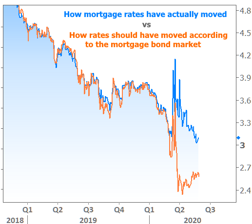
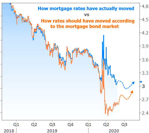
Does this chart mean that mortgage rates are destined to fall into the 2% range? Not exactly. For that to happen, mortgage bonds would need to remain at current levels–a feat likely dependent on a weaker economy than most of us would like to see. If the economy improves at a strong pace, that orange line should rise to meet the blue line. In that scenario, the blue line might not move very much lower.
Additionally, coronavirus has created considerations for the mortgage market that could result in a semi-permanent gap between the two. That means the orange line could begin to push the blue line higher even before they run into each other. Something like this, perhaps:
Even if rates don’t move significantly lower, they’ve been plenty low enough to fuel a refi boom and provide assistance to a recovery in home sales numbers (as we discussed last week). Now this week, newly-released Pending Home Sales numbers are saying “not so fast” to the idea that the worst is over for the housing market.
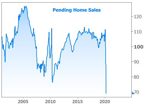
This definitely isn’t an upbeat chart for the housing market, but it’s not entirely unexpected. Economists figured April’s pending sales would decline by 15%, and the official tally ended up being 21.8%. We also know there’s a lag involved in the reporting of home sales data, and that lag means the data for this report was gathered at the worst possible time. Translation: this isn’t a housing market in freefall, but rather, one that’s preparing to find bottom.
More timely data confirms that claim. In fact, according to the Mortgage Bankers Association, applications for home purchases were at their highest levels since January last week. Incidentally, those January levels were the ONLY time purchase apps have been higher since before the financial crisis.
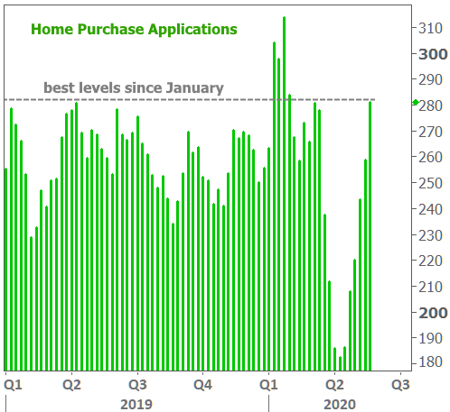
Before you get too terribly excited about this chart, it’s worth mentioning that Pending Home Sales data includes cash buyers and those who are financing outside of typical mortgage channels. The purchase application data only counts those applying for mortgages.
There are several past examples where Pending Sales have diverged greatly from purchase application data. Because of that, the jury is still out–to some extent–on the strength and certainty of a housing market bounce.
We do have one very big thing going for us: the market was healthy, happy, and improving up until coronavirus. As opposed to 2009-2011 when a throng of buyers remained unsure about the housing market, this time around, the throng of buyers is simply on hold because they have to be, and they’ll be glad to jump back in the market as soon as they can.
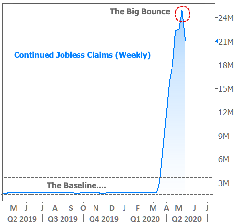
Of course, much of this depends on the ability of the economy to restore jobs to the millions who remain out of work. This week’s Jobless Claims data provided the first glimmer of hope there as the number of workers filing for ongoing unemployment claims dropped by nearly 4 million. That could certainly be the big bounce, but we knew that was coming. So much of what happens next for the economy depends on how well and how quickly we return to the baseline.
