This week was chock full of housing data ranging from construction and builder sentiment to the most recent tally on existing home sales. The takeaways can vary depending on your angle of approach. So let’s look at all angles!
A key news item came from the New Residential Construction report, which counts building permits and “housing starts” (the breaking of ground on a new home). The headlines essentially wrote themselves as housing starts hit the highest level in more than a decade.
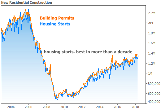
On the one hand, “highest in more than a decade” sounds impressive. On the other hand, considering where we were a decade ago, housing only needed to be “sideways to slightly stronger” to earn the distinction.
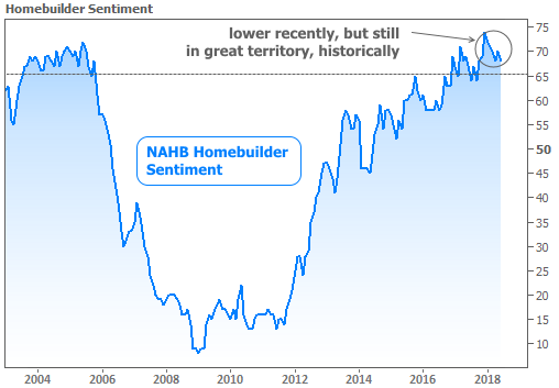
Caveats aside, things could certainly be much worse for home building, as can be seen in this week’s Housing Market Index from the National Association of Home Builders. Although builder sentiment is down in recent months, it remains in historically high territory.
In separate data, the National Association of Realtors released its monthly report on Existing Homes. Sales continue trudging mostly sideways, raising questions about a potential ceiling.
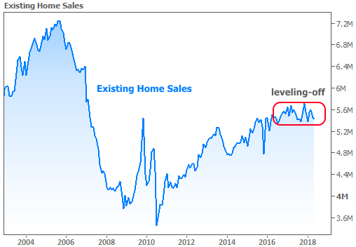
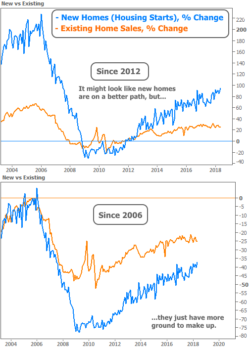
Based on the chart above, it looks like existing home sales aren’t doing as well as new construction. We can compare the two more fairly in terms of “percent change.” Even then, we can get two different impressions. For instance, with 2012 as a baseline, NEW homes look like the clear winner. But with a baseline of 2006 (before the crisis), new homes just have more catching up to do.
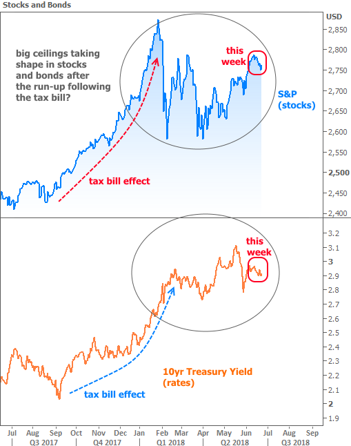
It’s not just housing data that has a tendency to look completely different depending on our vantage point. Stocks and bonds are another classic example. Conventional wisdom holds that bond yields (aka “interest rates”) and stocks tend to move in the same direction. That was definitely the case this week, as can be seen in the following chart. Over shorter time frames, such a high level of correlation is common, but the long-term charts look very different.
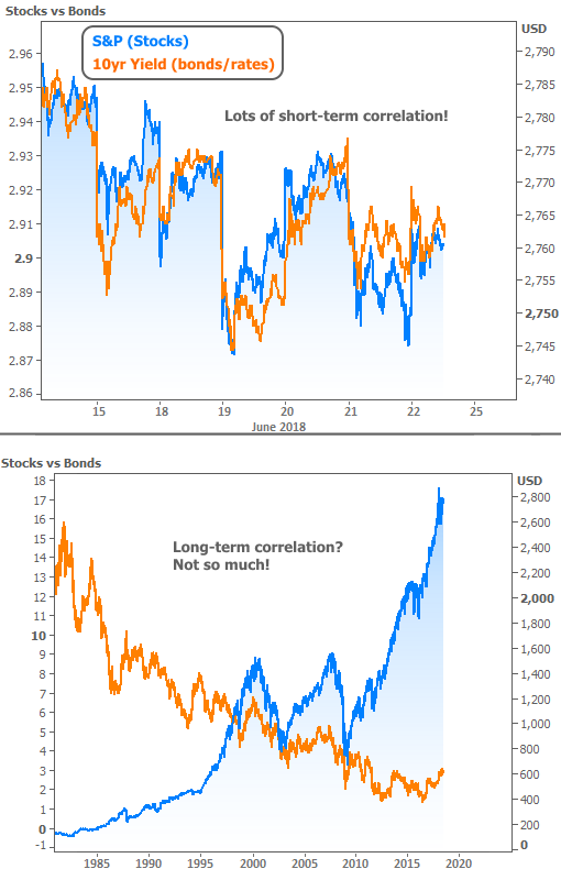
While that longer-term chart might seem like it disproves the conventional wisdom, it actually contains some clues. For instance, notice that rates (orange line) were generally rising and peaking at the same time as stocks in 2000 and 2007. If we were to zoom in on those time frames and re-scale the chart, we’d begin to see much more correlation.
Some of the market-watchers calling for a recession or a stock correction are seeing the same potential correlation over the past 12 months. It’s definitely NOT safe to assume this means a ceiling is in for rates. Rather, the point is that if stocks really are hitting a longer-term ceiling in 2018, the consolation is that rates would likely follow stocks lower.