Conventional market wisdom tends to classify stocks and bonds as archetypal investments on opposite ends of the risk spectrum. Stocks are for those who feel confident enough in the economy to take risks and bet on growth. Bonds are safe havens that offer at least some return no matter what.
With this in mind, it’s no surprise to see correlations. The month of June has been a great example. Both sides of the market even bounced at the same time right after the June 13th Fed announcement. (NOTE: the big spike in the blue line in late May was all about Italy, and isn’t relevant to what follows).
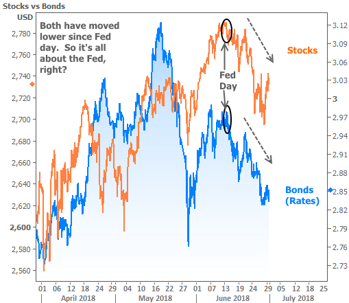
So, it’s all about the Fed?
While the Fed definitely had an effect, this chart actually tells us other forces are at work. The clue is that Fed policy tends to push stocks and bond yields in OPPOSITE directions.
Think of it this way: if the Fed is seen as being more generous (refilling the proverbial punch bowl, if you like), it’s good for everyone at the party. Stocks would rise and bond yields (which move inversely to bond prices) would fall.
In the chart, however, we see stocks and bond yields falling together. In other words, investors really are shedding risk in the stock market and moving some money into safer havens like bonds.
But why?
Trade war fears are high on most investors’ lists when it comes to explaining recent stock weakness and bond strength. The fact that we can plainly see both sides of the market react to trade-related headlines means it would be silly to argue. That said, it also might be good to expand.
Some investors are nervous that the longstanding economic expansion is going to “die of old age.” Trade war fear is just the latest reason to ask if it’s too soon to start thinking about the next recession (as we asked 2 months ago).
When markets are asking such questions, they tend to CONSOLIDATE. Consolidations are useful because they let us know that markets are getting ready to make their next move.
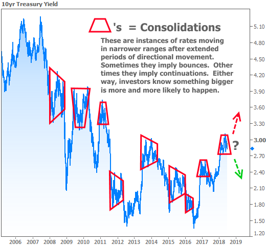
We can’t be sure if it will be a “bounce” or a “continuation”–only that it’s coming. In the current case, investors are particularly interested in the stock market’s consolidation because of where it sits in the grandest of schemes.
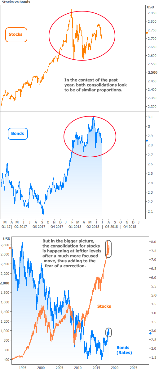
Simply put: if stocks start snowballing lower from there, things could get ugly. Fortunately, most of the recent economic data suggests the economy is firing on all cylinders.
If the data is good, why worry about a shift?
A simple “fear of losing something really nice” isn’t cause for much concern on its own. But there’s an important metric that more and more pundits are discussing, and it continues pointing in an alarming direction.
The metric in question is the YIELD CURVE. Technically, the curve refers to the whole spectrum of US Treasury yields, but for all practical purposes, it’s synonymous with the gap between 2-year and 10-year yields (which is why you may see it referred to as the “twos tens curve”).
Why do people care?
At least in terms of modern economic history, the curve has quite the batting average when it comes to predicting recessions, and the current trajectory of the curve makes the next one look inevitable.
If it’s inevitable, why aren’t markets panicking more?
First of all, nothing is ever truly inevitable when it comes to financial markets. The yield curve may not fully invert (2yr yields higher than 10yr yields), and even if it does, there’s typically considerable lag time between the inversion and its ill effects.
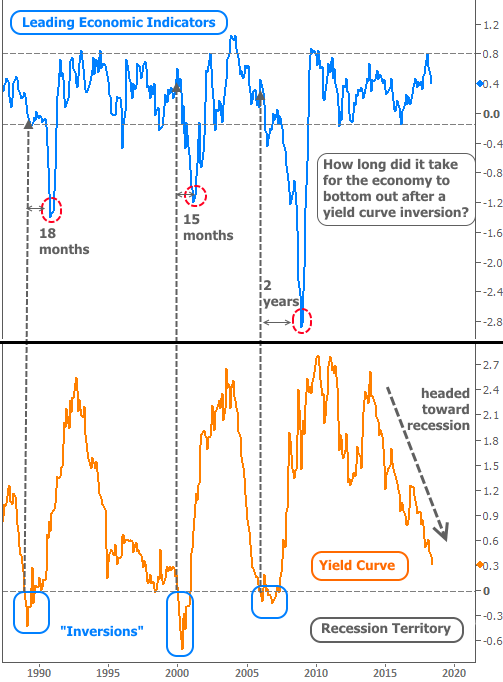
Perhaps the most important point made by the chart above was one that I didn’t highlight. Notice the drop in the yield curve heading into 1995. An inversion looked even more inevitable than it does in 2018. While the inversion did eventually happen, the next several years served to extend an already strong economic expansion.
Bottom line: there will eventually be a recession. In hindsight, scholars will say the yield curve proved to be a surefire indicator yet again. But for those of us living through the realities of this economy today–and especially for those of us who are stakeholders in the housing/mortgage markets, such surefire predictions leave much to be desired when it comes to adopting an outlook for the near-term future.