Mortgage rates dropped to new long term lows this week with the average lender at the best levels since January 2018. For the most part, we haven’t seen much volatility this year, but that could change soon.
The absence of volatility is a factor of uncertainty, more than anything. Sources of uncertainty include:
- Economic contraction potential in foreign economies (China/Europe especially)
- US/China trade relations
- Unclear economic impact from government shutdown (clouding the data)
- Brexit
- Policy shifts at the Fed and the European Central Bank (ECB)
Put another way, investors want to know if the global economic expansion (and especially the US economic expansion) will get any sort of 2nd wind before we start seeing more concrete signs of an economic contraction.
When uncertainty waxes, markets tend to trade in more narrow ranges and in less conventional patterns relative to one another. This week offered examples of both, but it will take 3 charts to show you.
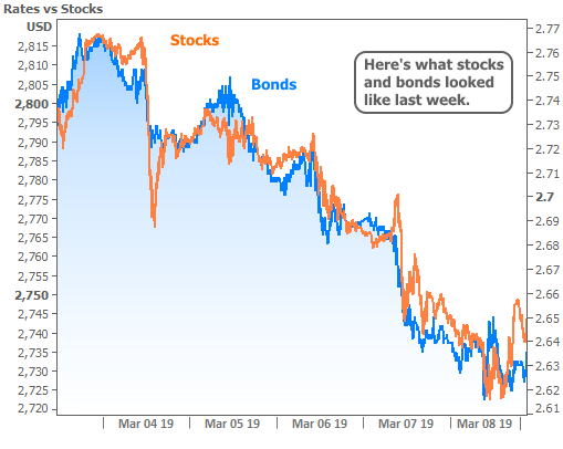
The first chart is actually last week’s stock/bond relationship, which sets the stage for the rest of my point.

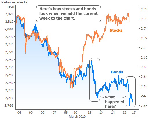
The next chart will incorporate all of the info above and add the current week to the mix using the same y-axis relationship from last week.

Clearly, the stock/bond relationship broke down, and clearly, there were a few key moves for either side of the market. What caused them?
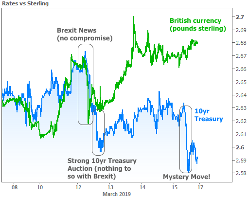
Early in the week, brexit-related headlines grabbed the market’s attention. The finer points are esoteric and perhaps boring, but the gist is that Britain is hoping to exit the EU with some sort of compromise deal that makes for a softer landing on the other side of the EU’s members only fence. Headlines fueled hopes for a compromise deal on Monday night, but were quickly walked back on Tuesday morning. That walk-back helped rates move lower.
Because a “no deal” brexit is thought to be more potentially damaging to the global economy, bonds improved (the blue line moved lower). That’s what bonds do when economic stability is called into question! Think of it like this: investors can buy protection from risk by buying bonds (which have a virtually guaranteed rate of return). When investor demand increases, bond prices increase. When bond prices increase, bond yields (or “interest rates”) fall.
If we remove stocks from the previous chart and add British currency, we can get a better view of the specific effects from the brexit-related headlines. This lines up well with Tuesday morning’s drop in Treasury yields , but it wasn’t the day’s only consideration for rates. The afternoon brought a scheduled auction of 10yr Treasuries. It saw surprisingly strong demand–essentially tipping off traders that other traders really wanted some 10yr Treasuries! Again, higher demand = lower yields/rates.

The 10yr auction was actually a revelation of sorts (circumstances suggested the auction could be tougher than normal). It carried bonds through the rest of the week with minimal damage, even as stocks and brexit sentiment argued for rates to move a bit higher.
Then on Friday morning, the “mystery move” took rates to the lowest levels in a long time. For Treasury yields, you’d have to go back to January 2019 to see anything lower. But for mortgage rates, you’d have to go back another 12 months!
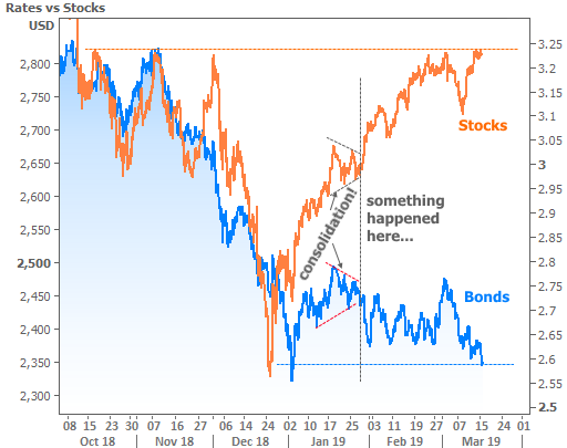
So what’s up with the mystery move? First of all, it’s small potatoes in the bigger picture. That said, the bigger picture also has a lot to do with those potatoes–specifically this bigger picture which shows the divergence between stocks and bonds. Notice that both have moved to challenge their best levels in months. Such behavior is reminiscent of their reaction to the Fed’s bond buying programs of the past decade, and this time is no different!

No, the Fed isn’t getting ready to unveil another quantitative easing (QE) package, at least not directly. Indirectly, however, markets are about to feel the same sort of QE-driven euphoria. In fact, they’ve been feeling it for a few months now.
The reason has to do with the Fed’s balance sheet which consists of bonds purchased during previous QE programs. At just under $4 trillion, it’s big, and it provides the Fed a big monthly income (bonds are like loans, and the Fed is the lender collecting the payments). Until 2018, the Fed had been using that income to buy more bonds. Since then, they’ve been letting the balance sheet run-off at a controlled pace.
In December, Fed Chair Powell said the run-off was on auto-pilot and that they didn’t see it causing problems. The stock market disagreed, and fell to its lowest levels in more than a year. Depending on one’s choice of verbiage, the Fed “caved” in January. At first, this happened in speeches with various Fed members saying friendlier things about monetary policy plans. Then it was made official with the January 30th announcement which introduced the notion of the Fed being “patient” with further rate hikes. In the post-meeting press conference, Powell alluded to an active discussion about ending the balance sheet run-off, and that was all markets needed to hear.
Understand that by ending the balance sheet run-off, the Fed would effectively be re-starting 10s of billions of dollars of bond buying each month. Just as 10s of billions of dollars of bond buying did during the QE era, it is now pushing stocks and bonds toward stronger levels. It’s no coincidence that both sides of the market are toeing the lines seen in the chart above. Next week brings the next Fed Announcement–one that will contain the most clarity we’ve yet seen on the balance sheet topic.
Long story short, traders are getting in position for good news. They’ll probably get it, but no one knows exactly how good it will be. Friday’s mystery move was just a small manifestation of that positioning process. If the Fed sees the need to be friendlier than markets expect on Wednesday, it would just be the tip of the iceberg. Conversely, if the Fed keeps markets waiting, both stocks and bonds might be inclined to head back in the other direction.


