Negative housing-related headlines are on the rise. Here are a few recent examples:
Foreign purchases of American homes plunge 36% as Chinese buyers flee the market
Another bad sign for the housing market
Housing is providing another in a line of troubling signs
Declining Mortgage Rates Aren’t Helping Home Builders
China’s Economy, Trade Talks and Trouble in the Housing Market
Housing’s Bad Spell Continues: Starts, Permits Fall in June
U.S. home sales tumble as prices surge to record high
Sounds pretty bad, right? But the reality for the housing market is not nearly as simple as some of these headlines would make it seem. The reality is actually much better.
A “slowdown” in home prices is one of the more popular topics recently. That’s not a bad thing in and of itself because prices have indeed been slowing down!
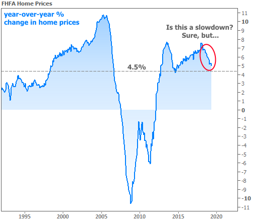
But there’s a big difference between deceleration in the pace of improvement and a contraction. While there are local pockets of real estate where prices have been flat or declining, the average home continued to appreciate at a 5% year-over-year pace in May, according to this week’s FHFA Home Price data.
Yes, 5.0% is a decline–a “slowdown,” if you will–from the 5.2% pace in April, but price growth is price growth. Prices aren’t falling until that 5.0% number turns negative.
Here’s another look at prices, but this time in index format (i.e. an outright number that tracks average home prices as opposed to a % change).
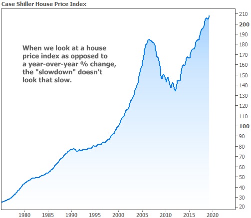
Ask any of the reporters who wrote any of those negative headlines to write a housing story based on this chart, and the tone would likely be very different. The issue is that those of us who go through the data with a fine-tooth comb are forced to focus on small changes in trajectory. Sometimes that happens at the expense of keeping the bigger picture in perspective.
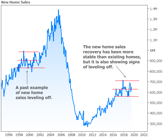
With that in mind, the following housing-related charts/data are all from freshly-released reports this week. I could tell you how Existing Home Sales declined to a 5.27 mln annual pace from 5.34 mln previously, how New Home Sales missed their forecast, or how mortgage applications declined despite low mortgage rates. But instead, I’ll just increase the time frame of the charts to offer context.
The Existing Home Sales chart is particularly interesting because it shows a clear correlation with the home price changes seen in the first chart (they’re overlaid again in the following chart). Notably, a home sales bounce can lead a bounce in home prices. In other words, the recent stabilization in Existing Sales could soon result in a similar stabilization for home prices.
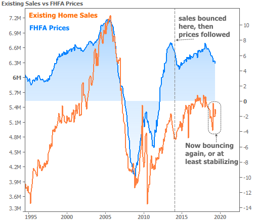
Even if Existing Home Sales are leveling off, and even if price growth continues to decline, there’s nothing wrong with more than 5 million existing homes changing hands every year, nor would there be anything wrong with a more sustainable home price appreciation rate in the 2-3% range (which would more closely match inflation). The big bad thing to avoid is a major contraction in prices/sales as seen in the last recession. But again, so far, all we’re seeing are signs of “leveling-off.”
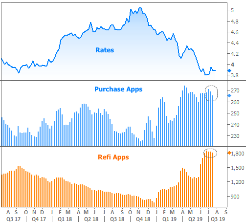
In financial markets this week, the European Central Bank (ECB) dominated the news cycle. Bond yields (aka rates) moved in anticipation of a friendly policy announcement. They continued to move when the announcement came through early on Thursday morning. But when ECB President Draghi held his post-announcement press conference 45 minutes later, investors weren’t hearing as much of a rate-friendly tone as they expected. The result was a quick snap back in both European and US rates.
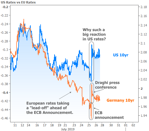
The question in the chart–“why such a big reaction in US rates?”–is a good one. Naturally, we’d expect European affairs to have the biggest impact on European rates, even though there is always some correlation. In Thursday’s case, there were two complicating factors. Most overtly, a strong economic report (Durable Goods) came out at the same time Draghi began speaking. This would normally carry implications for higher rates in the US, but traders may have held back as they waited to see what Draghi had to say.
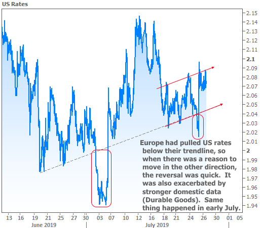
Beyond the data, there was also a technical component to the bounce. Longer term rates in the US (like 10yr Treasury yields, which tend to lead mortgage rate movement) have been trending gradually higher with a few exceptions. One of the exceptions was seen on Thursday morning when European rate momentum forced US rates below their trend line (dotted line in the following chart). Such lines can be used by traders as cues to buy/sell bonds depending on the direction of the breakout and other particulars. The last time European data pulled rates below that line, there was also a reason for a bounce back shortly thereafter, and the pace of the move was strikingly similar.
Next week likely brings more volatility with an action-packed slate of big-ticket economic reports beginning on Tuesday. The Fed’s big announcement will be the headliner on Wednesday, at least in terms of risk. The Fed will almost certainly be cutting rates by 0.25% and the market is already fully pricing that in. That means the Fed’s verbiage will be the big potential market mover. If the Fed manages to serve up a warm bowl of porridge (i.e. no crazy market reaction), the week’s remaining economic data becomes all the more important. After all, it’s the data that will do more than anything to shape the Fed’s future stance on rate cuts.


