The future is always uncertain when it comes to financial markets and interest rate movement, but there are times where a certain series of events seems more likely. For most of 2019, mid-March looked to be one of those times.
The year began with a sharp move lower in rates–sharp enough that it wasn’t sustainable. Rates rushed to long-term lows on January 3rd and then bounced higher. Fortunately, they found a ceiling shortly thereafter. That ceiling ended up being the top of the sideways range we’ve been following ever since.
To be fair, it looked to be broken by the end of February based on the following chart from a previous newsletter:
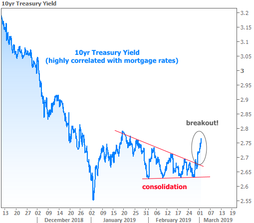
But here’s what I had to say about it at the time:
“Is this the end of the road for our nice run of low rates in 2019? It’s far too soon to conclude such things. Most traders are looking for the market to make bigger decisions in mid-March after the next Fed meeting. Between now and then, rather than plan on rates skyrocketing, a better baseline would be to shift the goalposts to something more horizontal, as seen in the following chart.”
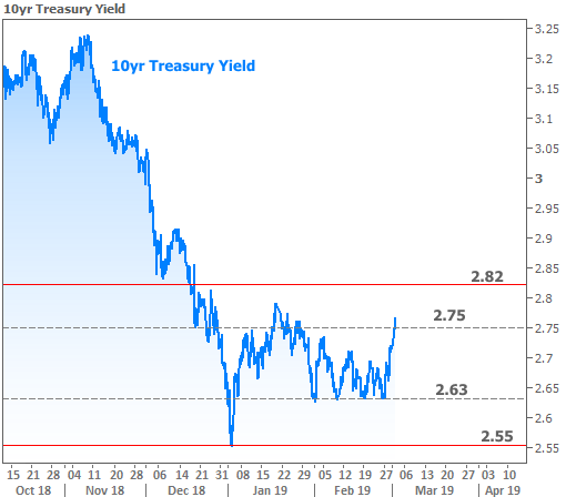
Fast forward to this week and it was indeed the Fed Announcement that served as the catalyst for an actual breakout. This time around, it’s going in our favor.
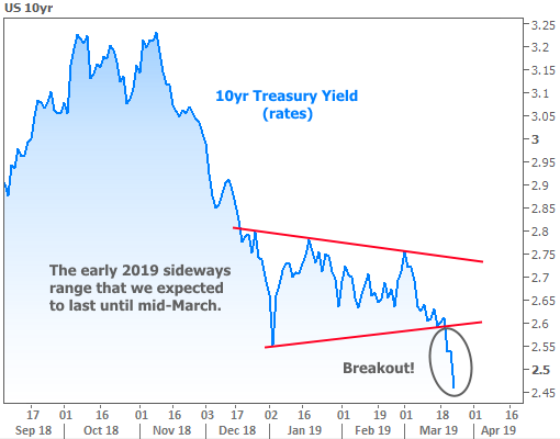
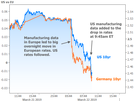
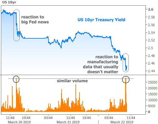
If you see the little hitch in the blue line in the “breakout” section above, that’s as far as the Fed news was able to get us on Wednesday. The rest of the move happened Friday on a combination of weak European manufacturing data followed by similarly weak US data.
So is it the Fed or is it manufacturing data? And is it about the US or Europe?
The answer is “yes.” The Fed sets policies based on its interpretation of economic data and risks to financial stability. Those policies can have massive impacts on markets, but they’re ultimately beholden to the underlying economic realities. When the economy is perceived to be at more risk, the Fed is more likely to enact policies that are friendly for rates.
This week, the Fed surprised markets by announcing that it would stop shrinking its balance sheet (if you really want to dig into the nuts and bolts, here you go). In plain language, this means the Fed is going to be buying way more bonds in just over a month, and when the Fed buys lots of bonds, it helps rates move lower.
The mere expectation of such a Fed shift was behind last week’s drop in rates, but the actual policy change was even more aggressive than markets expected. It was so aggressive that one may wonder just what sorts of red flags the Fed is seeing. Sure, they’ve SAID they’re concerned about a potential downturn in Europe with global consequences, but where’s the proof?!
Then a day a half later, the Eurozone manufacturing data comes out at the lowest levels in years, and European bond yields fall into negative territory. Score one for Fed apprehension. Then the US manufacturing data (highlighted in the chart above) spoke to the “global consequences” just a few hours later.
Bottom line, the Fed’s concern is good for rates, and it was vetted by weak EU data and then by similarly weak data in the US. How do we know the US manufacturing data mattered so much to the bond market? Because it produced a volume spike as big as Wednesday’s Fed news (which is unheard of for this particular report):
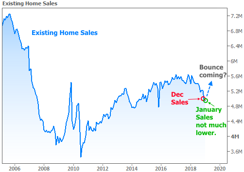
But not all the economic data was bad this week. In fact, if we had to choose one economic report to be much stronger, Existing Home Sales would be it! Several recent newsletters have held out the possibility (or even probability) that we’d see something like this in Existing Sales:
Why 2019 Could Actually be Great For Housing and Mortgage Markets
Home Sales Bouncing Back
Why The Housing Market Cares About The Fed (which contained the following chart)
And this is how Existing Sales data looks after this week’s installment:
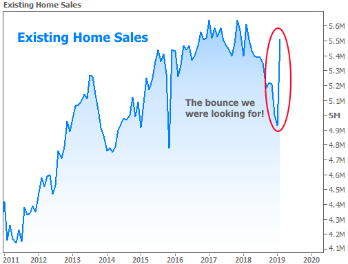
Long story short, all the potential positive cues that looked like they should play out for home sales ended up having the expected impact. The fact that this week’s data arrives when mortgage rates are hitting new long-term lows is just icing on the cake.


