Home sales numbers and other housing-related data have been hot topics of conversation recently. Some say positive housing trends are over. Others say it’s no big deal. The truth continues to be somewhere in between.
It’s clear that we’ve turned some sort of corner when it comes to the housing market for 3 reasons:
1. Existing Sales weakness
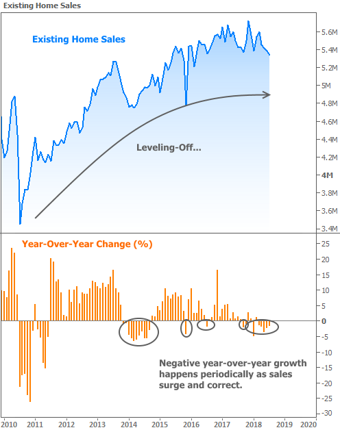
As early as the end of 2017, we’d already seen year-over-year growth in existing home sales contract in 2 consecutive reports. That was the first time that had happened since the rate spike of 2013 led home sales into a cooling period for much of 2014. Since then, most of the reports have come in at slightly lower levels versus the previous year.
2. Price Gains Turned a Corner
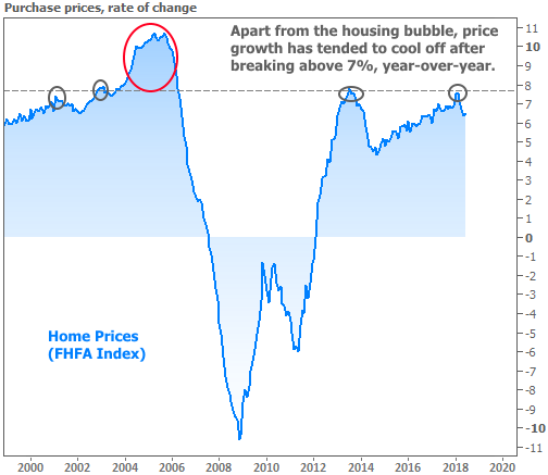
The annual pace of home price gains began to decline as of this Spring–also for the first time since the 2014 cooling period. To be clear, home prices are still appreciating on average. But this year’s appreciation rate has been lower than last year’s for several months now.
3. Inventory is Finally Rising
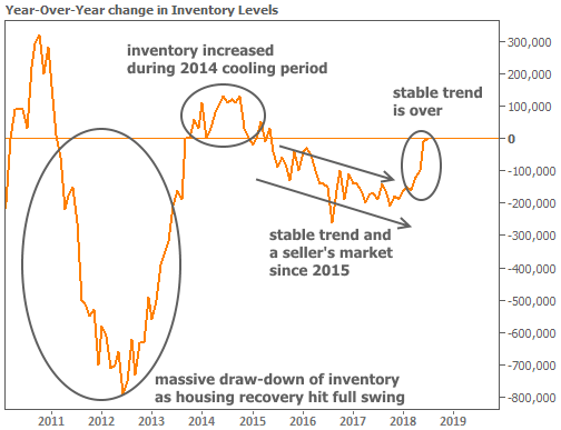
However you want to slice it–time on market, months of supply–inventory is doing something different than it had been doing. 2015-2017 marked two years of an extremely stable trend of contraction (falling inventory). People were buying more homes than sellers were bringing to market. That began to change in early 2018.

Inventory serves as a great jumping-off-point for the rest of this conversation. Let’s look at the chart above again. As of this week, and for the first time in several years, the number of existing homes for sale matches the number from the same report last year. Before that, inventory was contracting. Indeed, the National Association of Realtors frequently cited inventory as a key constraint for home sales. In that sense, it could just as easily make the list of factors that may help home sales going forward.
If anything, we’re really only seeing another instance of “cooling-off” for housing numbers–a shift from an outright seller’s market to something that gives buyers a fighting chance. Any time that happens, the early phases end up looking like a reversal. In both cases, lines on charts change their path and year-over-year growth turns negative. It’s happened to existing home sales on multiple occasions throughout the recovery.

Speaking of fighting chances, the cooling in home price appreciation wasn’t a moment too soon. Here too, we can take one of the negative talking points for the housing market and counter with the “too much of a good thing” argument. Price appreciation can only outstrip income gains for so long.

Interest rates have been a key supporting actor. Up to a certain point, the rising rate environment of the past 2 years didn’t cause major problems. This was especially true as rates recovered during much of 2017. But in 2018 the spike resumed–with unavoidable implications for affordability eventually taking a toll on home price appreciation.
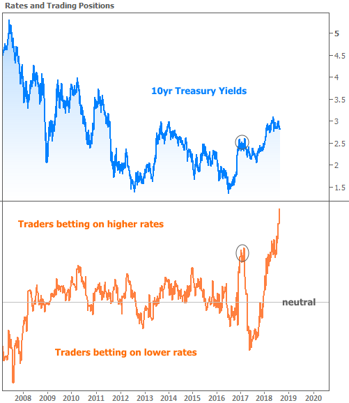
Paradoxically, the good news is that traders are betting more heavily than ever that rates will continue to move higher. The following chart shows rates in relation to trading positions. The higher the orange line, the more traders are betting on rising rates. This can actually be a contrarian indicator at times (like early 2017). Trading positions often become this lopsided only when traders are chasing some underlying theme that is already nearing completion. In the simplest terms, it would be like saying rate sentiment has hit rock bottom and we could soon be looking at a “nowhere to go but up” situation. Or is that “nowhere to go but down?”

The major caveat to that line of thinking on rates is that the word “soon” could mean months or even years when it comes to the bond market. Still, it’s a much better position to be in compared to the beginning of 2013 or the middle of 2017 when trading positions were skewed in the other direction. In both cases, the result was a swift move toward higher rates.


