It was a busy week for economic data with several reports that were pertinent to the housing market. In addition to being the perennial top dog among economic reports, this Friday’s jobs report was especially important due to its role in the Federal Reserve’s decision-making process.
The Fed is widely expected to announce a forthcoming reduction (aka “tapering) of its bond-buying program by the end of the year. If the jobs report had been strong enough, investors thought the Fed might make the announcement a few weeks from now at the September policy meeting.
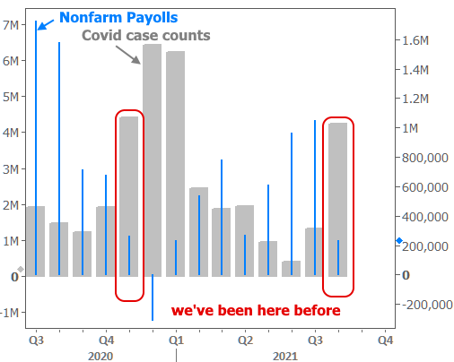
But the strength of the jobs report is a matter of great debate. As far as the headline job tally is concerned, Nonfarm Payrolls (NFP) came in at 235k versus a median forecast of 728k. That’s a big miss!
Poll a hundred market strategists about the likely market impact and 99 of them would guarantee you a bond market rally (which is good for rates). As it happened, however, bonds lost ground after the jobs report. It was a counterintuitive result, to be sure, and pundits rushed to make sense of it on Friday morning. Here is a brief review of explanations (with the reality likely being some combination of all of them).
Sector-Specific Drama
Friday’s “miss” was concentrated in Retail Trade and Leisure/Hospitality–sectors that had been chugging along nicely before the surge of the Delta variant. It’s a bit too soon to say we’ve turned a corner in daily case counts, but the pace has been decelerating. If that continues, it implies a quick return to stronger numbers (because the job losses weren’t broad-based, but rather, focused in sectors that are most affected by covid).
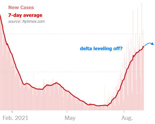
In other words, take away delta and this suddenly looks like a much stronger jobs report. Indeed, the relationship between the payroll count and covid case counts is very consistent with last November.
Labor Market Tighter Than It Seems?
Some analysts have suggested the other way to look at Friday’s weak number would be as evidence that the post-covid economy simply doesn’t have as many jobs to go around as the pre-covid economy. Thus, the Fed would have to accept this as the new normal and move to taper sooner than later. Interesting theory, but recent data on job openings disagrees:
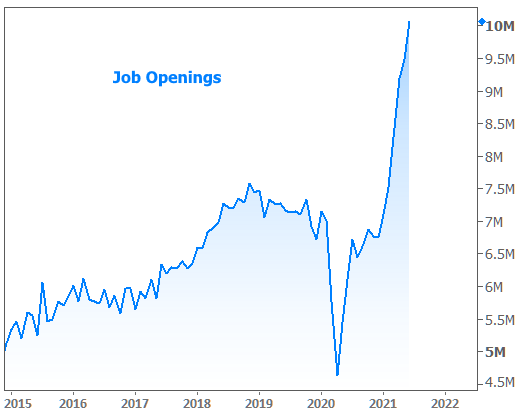
This only reiterates the likelihood that the low payroll count reflects a temporary covid-driven reality.
Forget Tapering. What About Rate Hikes?
Another key observation involves the difference between longer and shorter term bonds. Specifically, 2yr Treasuries were not weaker on the day. This coincided with investors pushing out Fed rate hike expectations.
The Fed Funds Rate correlates with shorter-dated bonds like 2yr Treasuries. And sometimes, traders express their preference for shorter-dated bonds at the expense of longer-dated bonds like 10yr Treasuries or MBS (the mortgage-backed securities that underlie mortgage rates). This is an ongoing trend in Q3–one that coincides perfectly with the proliferation of the delta variant.

The tangential implication is that the bond market has largely moved on from obsessing over the timing of Fed tapering and is now focusing more on the timing of the lift-off in the Fed Funds Rate. But justifying this move would require inflation to accelerate in a more troubling way (as inflation is one of the two key inputs that drive Fed policy changes).
Inflation Considerations in Average Earnings Data
Some analysts expressed concern over the big increase in average hourly earnings in the jobs report for exactly that reason (i.e. higher wages = higher inflation).
While this is great in theory, the post-covid reality has consistently shown price pressures to be a factor of limited SUPPLY as opposed to excess demand. In any event, the market simply isn’t pricing in any major inflation drama. The green line below shows market-based inflation expectations (the difference between Treasury yields and their inflation-protected counterparts).
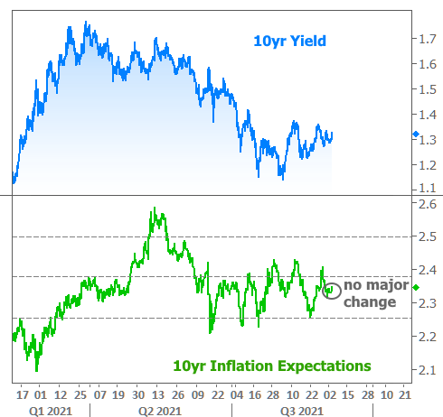
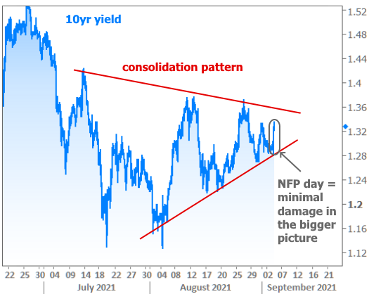
Avoiding Overthinking The Move and Focusing on The Consolidation Pattern
In looking at the chart above, the mind’s eye may be tempted to see some converging lines surrounding recent movement in 10yr yields. The following chart shows that convergence and offers yet another approach to explaining away today’s counterintuitive movement (i.e. it doesn’t really matter if it’s still so perfectly contained by the consolidation range).
Maybe it’s Just Better Than it Seems
But the last chart is probably the most compelling. It also relies on the simplest explanation: the market seems to be reading the jobs report as being better than the headline suggests. That inference relies on the fact that both stocks and bonds lost ground simultaneously (and fairly symmetrically)–a pattern that typically plays out when traders are adjusting their stance on Fed accommodation.

This jives fairly well with the initial point about retail and hospitality/leisure sectors driving the weakness. It also gives credit to other parts of the report like the low 5.2% unemployment rate and stronger average hourly earnings data.
Last But Not Least: Treasury Supply Next Week
Speaking of next week, there’s another compelling consideration that can’t be shown in a chart. It has to do with the scheduled Treasury auction cycle (3yr, 10yr, and 30yr). Of the 2 types of auction cycles, this is the tougher one for the market to digest (the other version is 2/5/7-year, and it’s easier to bid on shorter duration bonds).
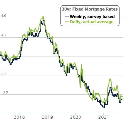
It’s not uncommon to see bonds give up some ground on the Friday before a 3/10/30-yr auction week. Many traders may have been waiting to make that move until after the jobs report. The Treasury supply issue is even more plausible when we consider that MBS didn’t have nearly as bad of a day on Friday. In fact, the average lender was fairly close to Thursday in terms of rate offerings, thus staying in historically low territory.
Other Data This Week
It was a mixed bag for the housing market as home prices continued higher at ludicrous speed. Actually, they may have gone plaid…
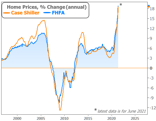
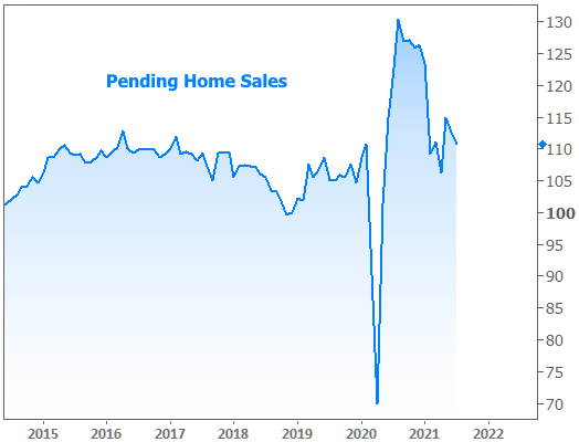
Tight inventory–the main culprit for the price surge–is also getting most of the credit for the decline in Pending Home Sales.
