It’s easy enough for media outlets to accurately report the underlying facts when it comes to mortgage rates and housing. It seems far harder to find consensus when it comes to interpreting those facts. Let’s clear up some of the misconceptions driving this phenomenon as we recap the week’s market movement and housing-related developments.
For many consumers and reporters (and unfortunately, more than a few loan originators), the most glaring source of confusion at the moment is the discrepancy between 10yr Treasury yields and mortgage rates. The 10yr yield, above all other interest rates, has long been thought to dictate mortgage rate movement. In a way, it actually does that, but not to such an extent that mortgage rates always follow in lock-step.
The 10yr is the most widely traded longer-term bond in the US Treasury complex. It’s a benchmark by which all other long-term rates are judged and measured. Investors are essentially faced with a choice to buy a risk free bond from the US government at a lower rate of return or a substantially similar bond at a higher rate of return, but that also carries additional risks.
MBS (the mortgage-backed securities that underlie mortgage rates) are just such an investment! The biggest risk for the MBS investor is a rapid change in refi demand. In fact, if borrowers were forced to hold their mortgage for the entire term, mortgage rates would be extremely close to Treasury yields and the gap between the two would be almost perfectly constant.
But borrowers can and will continue to refinance when rates drop enough or keep their loans longer than expected if rates are on the rise. Changes in refi behavior directly affect investors’ returns. That’s why mortgage rates are higher than Treasury yields. The spread compensates investors for the extra uncertainty.
When rate volatility is within historic norms, the spread between MBS and Treasuries doesn’t move too quickly. But when rates are changing massively–as they have in 2019–it can do a lot of damage, and investors will quickly demand much higher spreads before buying MBS. This translates to mortgage rates being higher than they otherwise would be if they were keeping consistent pace with Treasuries.
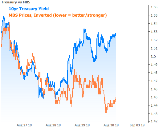
Fortunately, MBS are similar enough to Treasuries to have been benefiting from the broader drop in rates. As such, mortgage rates are indeed at long-term lows. They’re just not as low as some would expect. The following chart shows how MBS prices were moving in relative lock-step with Treasuries followed by the big divergence in August.

That was August’s big story when it comes to rates. This week’s big story is much cooler. It involves MBS beginning to push their spread back in the other direction (something we expected to see as soon as it looked like the drop in Treasury yields was leveling-off). The following chart has the same two lines, but the y-axis scaling has been adjusted so we can zoom in and look at this week’s relative performance.
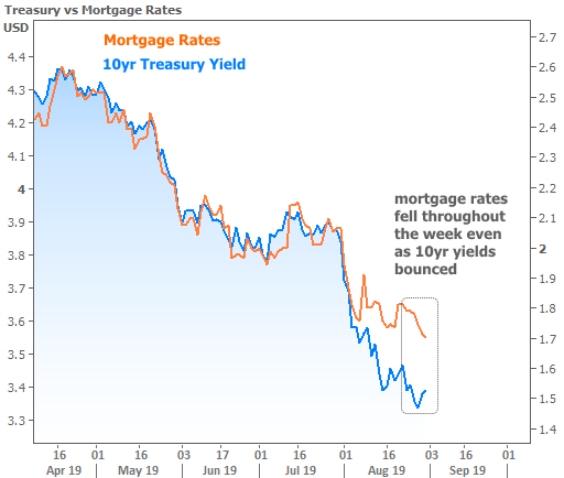
To bring all this home, here’s how actual mortgage rates have moved relative to Treasuries:
Even though mortgage rates may not have fallen as fast as Treasuries, they’ve fallen more than enough to spark the first real refi boom we’ve seen since 2016. Some news stories from this week called the refi boom into question because the number of refinance applications declined week-over-week, but this is absolutely to be expected. The following chart shows how rising refi demand will periodically level-off even as rates continue lower.
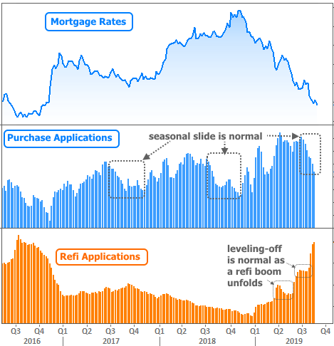
Incidentally, the purchase application data was another source of confusion this week. Several news outlets cited the decline as evidence that buying demand was shrinking. Someone should let them know that mortgage application data is not seasonally adjusted and that the August decline looks almost exactly the same almost every year. Even then, this is WEEKLY data (whereas most reports are monthly), and there will always be some degree of “noise” even if we were viewing it in seasonally adjusted terms. The noise wouldn’t be nearly as noticeable if this were a monthly report.
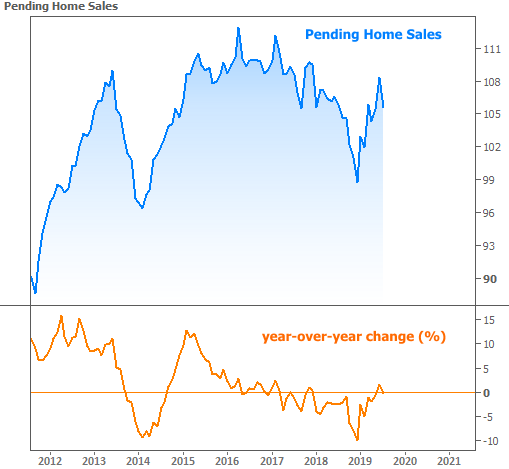
But even in monthly housing-related reports, we were faced with some mixed messages. The highly-regarded Pending Home Sales data was released for the month of July this week, and it showed what some referred to as a troubling or mysterious decline. Even some industry experts concluded that lower mortgage rates weren’t having the expected effect on home purchase demand.
This one is more debatable than the other examples of ‘misconceptions.’ It is true that Pending Sales declined in July. It is also true that the decline COULD be indicative of some issue that’s holding back healthier housing demand. On the other hand, it’s a good idea to remember that even the monthly housing data is noisy, with multiple examples of declines even in broader trends of improvement.
I’m not saying this is definitely going to be a broader trend of improvement and that you should ignore the decline–simply that the single month’s decline doesn’t really tell us anythingconclusive. Add to that the fact that Pending Sales were still very close to unchanged in year-over-year terms and a better conclusion might be that sales have leveled-off after recovering from late 2018’s weakness.
Away from housing and mortgage markets, we may be able to find another misconception or two. In broader financial markets this week, trade-related headlines continued to drive volatility. Notably, stocks managed to move slightly higher from mid-week while bond yields held mostly sideways.
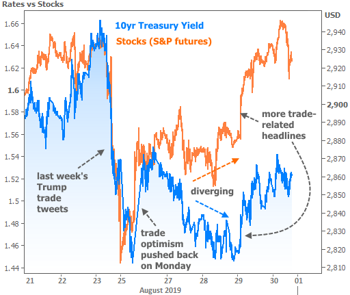
Correlation between stock prices and bond yields is one of themost common misconceptions there is–largely because it’s so frequently TRUE. It just depends upon when you look. For instance, if you only charted the 23rd through the 26th above, stocks and bonds would indeed be right on top of each other. The more time we include in a chart, the more they diverge.
Let’s test this theory by adding even more time. In the following chart the divergence is obvious. Each line looks like it has a completely separate set of concerns. But consider that 2019 has seen a relative sea-change in the Fed’s willingness to cut rates (something that helps both stocks and bonds). Also consider that bonds are typically early adopters of a gloomy global outlook whereas stocks are still able to benefit from the here and now. 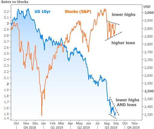
In other words, the US economy is still in good shape overall, so stocks are higher, even if they’re looking a bit indecisive. But investors are concerned the economy could be at a tipping point some time in the next 6-18 months, so longer-term bonds have to account for that risk by moving lower in yield. Markets will be closed for Labor Day on Monday but apart from that, next week brings several important economic reports that will help investors continue to hone in on an eventual tipping point.