In about 2 weeks, the big bond rally of 2019 (i.e. the big drop in rates!) will officially be 1 year old (because it actually began in the 2nd week of November). This has been a uniquely interesting year for rates. Granted, there are plenty of other years with the same sort of big overall movement, blatantly obvious motivations, paradoxically subtle motivations, and uncertainty-inducing curveballs, but few have combined all of those components.
The uniqueness of the rally makes it hard to say exactly what might happen next. In fairness, that’s always hard when it comes to financial markets. The market has a nasty tendency to go out of its way (or so it would seem) to prove people wrong just when they think they have things figured out.
I’m speaking in generalities here, but there is hard math underlying the point (or a hard hypothesis anyway) known as the Efficient Markets Theory. In a nutshell, it says asset prices (like those for the bonds that determine interest rates) reflect everything that can be known about them today. Therefore, they will only react to genuinely NEW information.
To make matters even more uncertain, a lot of time, effort, and money go into trying to predict what that new information will be. Those predictions in turn become part of “everything that can be known today.” What that means, in essence, is that you’d actually have to predict something that no one else can predict in order to get a leg up on future potential movement in stocks, interest rates, etc.
What we can do is talk about what we’re already seeing in the charts and what the implications MIGHT be. This can help us prepare for risks and opportunities associated with various outcomes.
Many rate watchers are keeping a close eye on the breakdown of the long-term rally trend as it relates to moving averages and simple trend lines. A moving average is just that: the average rate on any given day for the past x number of days.
Some market watchers believe moving averages hold power to act as floors, ceilings, or indicators of an impending shift. But for any prediction someone might make based on a moving average, there are plenty of past examples where the opposite held true.
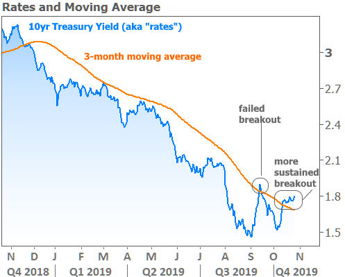
What a moving average CAN do for us, however, is serve to emphasize the point that a particular trend is “having second thoughts,” as it were. The following chart shows one way to look at this with a quarterly moving average (the average 10yr yield for the preceding 3 months). The first “failed breakout” could also be seen as the first instance of “second thoughts.” Some would see the “more sustained breakout” as evidence that the 2019 rally may be over.

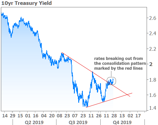
The next chart provides another way to essentially arrive at a similar conclusion. The consolidation pattern that came into focus over the past few months is the most pronounced of its kind in 2019. These pennant-shaped patterns of lower highs and higher lows often emerge when investors are pumping the brakes on the prevailing trend.
And that’s really the only thing such patterns tell us. They do not, for example, imply the size and direction of the next move. That said, breaking out from the upper line is logically more discouraging for fans of low rates than breaking the lower line. If we think of the two red lines as competing trends, this is like saying the trend toward higher rates (represented by the lower red line in the chart below) is “the winner.”

While neither of the above charts predict a bleak future for rates, they can serve to remind us of that possibility. Indeed, few instances of downward movement in rates have covered as much ground or lasted as long as 2019’s example. But remember, if we look back far enough, we can usually find examples that argue the other side of the point.
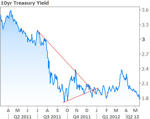
So if you’re not ready for rates to move higher yet, then root for a 2011 type of scenario where rates stayed sideways in a volatile range through the middle of the following year before ultimately going LOWER. Without the benefit of the following charts axis labels, it would be easy to mistake it for 2019.

What’s the point of all this? Mostly just to advocate against complacency after an awesome run for rates. As always, the uncertain outcomes of data and events in the coming months have the best chance to set the tone. These include economic data at home and abroad, US/China trade relations, Brexit developments, geopolitical developments, and the global central bank response to all of the above.
Speaking of central bank responses, next week brings yet another installment of the latest policy announcement from the Federal Reserve. As you may have heard, the Fed is almost certain to cut rates yet again. If you think that’s great news, think again! Remember that Efficient Market Theory discussed above.
Financial markets have already assumed and acted upon the probability of next week’s Fed rate cut. That means any effect it would have on mortgage rates has already been felt (mortgage rates can move daily whereas the Fed only changes its rate once every 6 weeks). If you need more convincing, just revisit THIS NEWSLETTER from a few weeks back.


